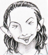
The Evolution of Andrea Pt. 1
What I Used: Pencil and pastel rubbed on with Q-tips on Strathmore pastel paper.
Inspired by: The design for Andrea that I featured last week was just not working out. For some reason, I was having a lot of trouble-- she was very difficult to draw. I did that one nice drawing, but all subsequent ones really sucked. So, I decided it was time to redesign her. I thought this look would be cooler (especially with the hat) and simpler to draw. I had no trouble with repeat sketches, she still had kind of an 'artsy' look about her, and she was actually fun to draw now.
Why the Artist Basically Stuck with This Design, But Made Some Changes: I loved the new design, but there was just one problem: she was a little too pretty. Andrea is a more caustic character- wouldn't you say?- so to balance that, I wanted to make her cute but not too cute, if you know what I mean. And you all have probably already seen the final design-- it's Andrea's profile pic here. I still use that drawing as my model to this day.
Thanks for reading, everyone. Next time I'll have another evolution pic, because it's fun talking about them. I hope it's fun for you guys to read about them! Remember, no strip this Friday, but YJ will have you taken care of on Sunday. See ya!


 T
T


No comments:
Post a Comment